Data is Beautiful
A practical book on data visualisation that shows you how to create static and interactive visualisations that are engaging and beautiful.
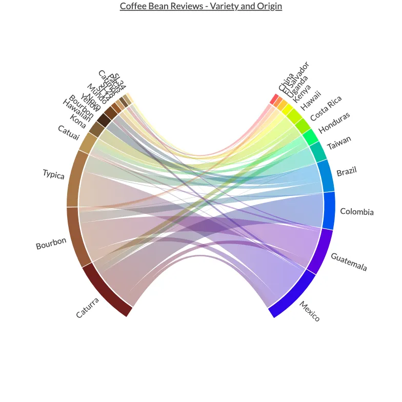
Get the bookdata is beautiful Arabica Coffee Beans - Origin and Variety
Arabica Coffee Beans - Origin and Variety

From the collection
Data is Beautiful
A practical book on data visualisation that shows you how to create static and interactive visualisations that are engaging and beautiful.