Data is Beautiful
A practical book on data visualisation that shows you how to create static and interactive visualisations that are engaging and beautiful.
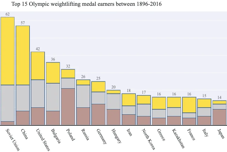
Get the bookdata is beautiful Olympic Weightlifting Medals with Stacked Bar Charts
We're going to use 120 years of Olympic history to create a visualisation. Let's set our sights on something that illustrates the distribution of Olympic medals awarded for the weightlifting sport.

From the collection
Data is Beautiful
A practical book on data visualisation that shows you how to create static and interactive visualisations that are engaging and beautiful.