D3.js (Data-Driven Documents) is a JavaScript library for manipulating documents based on data1. On its own, D3.js is powerful enough to let us achieve almost anything with regards to visualisation. However, it's often the case that people find D3.js either too hard to use or that requires too many lines of code to produce something simple, e.g. a bar chart.
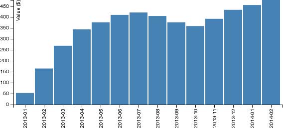
Using the bar chart example, we can find two D3.js code examples with the search term "d3js bar chart". The first hit is named "Simple d3.js bar chart" and dated 12-May-2020. Data aside, the full document (including HTML and JavaScript) comes in at 98 lines, and it produces the following:

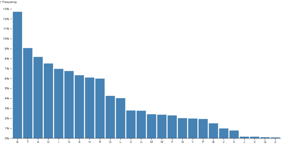
Another example2 is from the D3.js gallery, it's named "Bar Chart" and dated 15-Nov-2017. It comes in at just over 50 lines excluding HTML, it's hosted on Observable (a platform for exploring and visualising data) so those expecting to copy/paste code to get something running locally may struggle, and it produces the following:

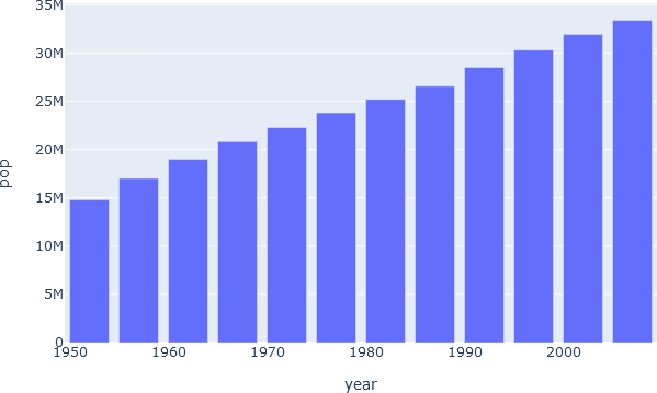
The same people may use examples from other libraries to support their claim. Let's look towards bar charts with Plotly3, where we'll find that, data aside, the example demonstrates the output of a bar chart with a single line of JavaScript. Opening up the sample example in code pen to include the HTML brings it to less than 10 lines, and it procues the following:

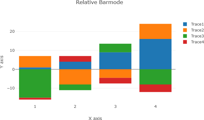
Data aside, with only a few more lines of code Plotly can produce the following:

Even with this limited example, it's easy to see where people are coming from when they complain about D3.js and its difficulty.
So why would anyone want to waste their time with D3.js? The answer depends on the context. If all you want to do is create a pie, line, bar, or area chart then it's likely D3.js is overkill - especially if you don't already know how to use it. It will take you far longer to create your charts with D3.js, and you'd likely have a better time using something like Plotly, matplotlib, Highcharts, Google chart tools, Chart.js, Tableau, Microsoft Excel, and so on. Some of these libraries are even built on top of D3.js, e.g. Plotly which has the following introductory sentence in its bar chart documentation "How to make a D3.js-based bar chart in javascript."3.
But what happens when we want to create something that's more than just a {simple|basic|standard|normal} data visualisation? Perhaps we need:
- To work with HTML, SVG, and CSS.
- Full control over the aesthetics of visualisations, not just changing colours, font-size, etc.
- Full control over the behaviour of visualisations, enabling more than just mouse over tooltips and brushing.
- To create an entirely new and unique type of visualisation.
In which case, D3.js will often be the most feasible option. D3.js sells itself as a library for manipulating documents based on data, and whilst it does have helpful components that make charting possible, it can be used for much more.
Let's take a look at some examples of what we can do with D3.js that we can't do with the aforementioned alternatives.
In the first example made with D3.js, we can see an animation of a colour changing circle moving up along a sloped path before falling back down with a bounce.
It's a fairly simple example and one that we'll look at closely later in the book, but already we can see that we've created something that we couldn't have if we were to use one of the alternatives. There is of course the point that it isn't a data visualisation - but perhaps it could be!
In the second example made with D3.js, we have an interactive Chord diagram illustrating the relationships between two features, complete with rich popups on mouse hover.
With these examples, it's easy to see what we can achieve with D3.js and where it can add value.
There is a wealth of cookbook-style resources available for D3.js visualisations, meaning you can create some interesting visualisations by copying some code and passing in your data. However, what this book aims to be is a practical journey through the many components of D3.js. Many sections will build on the last, and new component features will be introduced in small increments rather than being buried amongst a bunch of other newly introduced code. By the end of this book, we want to be able to create new visualisations from the ground up and modify the behaviour of existing ones.
Note
I aim to generate everything in this book through code. This means you will see the code for all my figures and tables, including things like flowcharts. Many of the visualisations are animated and interactive, so it's recommended that you generate the output using the code listings.
This book is currently available in early access form. It is being actively worked on and updated.
Every section is intended to be independent, so you will find some repetition as you progress from one section to another.

