
Preamble
import numpy as np                   # for multi-dimensional containers
import pandas as pd                  # for DataFrames
import plotly
import plotly.graph_objects as go    # for data visualisation
from plotly.subplots import make_subplots
Introduction
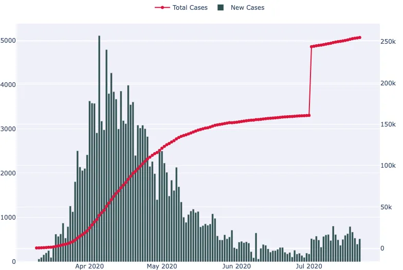
In this section, we're going to use daily confirmed cases data for COVID-19 in the UK made available at coronavirus.data.gov.uk to create a time series plot. Our goal will be to visualise the number of new cases and cumulative cases over time.
Terms of use taken from the data source
No special restrictions or limitations on using the item’s content have been provided.

Visualising the Table
The first step is to read the CSV data into a pandas.DataFrame and display the first five samples.
data = pd.read_csv(
    "https://datacrayon.com/datasets/coronavirus-cases_latest.csv"
)

data.head()
| areaType | areaName | areaCode | date | newCasesByPublishDate | cumCasesByPublishDate | |
|---|---|---|---|---|---|---|
| 0 | nation | England | E92000001 | 2020-07-22 | 519.0 | 255038 |
| 1 | nation | Northern Ireland | N92000002 | 2020-07-22 | 9.0 | 5868 |
| 2 | nation | Scotland | S92000003 | 2020-07-22 | 10.0 | 18484 |
| 3 | nation | Wales | W92000004 | 2020-07-22 | 22.0 | 16987 |
| 4 | nation | England | E92000001 | 2020-07-21 | 399.0 | 254519 |
Let's filter this data to only include rows where the Area name is England.
data = data[data["areaName"] == "England"]
data.head()
| areaType | areaName | areaCode | date | newCasesByPublishDate | cumCasesByPublishDate | |
|---|---|---|---|---|---|---|
| 0 | nation | England | E92000001 | 2020-07-22 | 519.0 | 255038 |
| 4 | nation | England | E92000001 | 2020-07-21 | 399.0 | 254519 |
| 8 | nation | England | E92000001 | 2020-07-20 | 535.0 | 254120 |
| 12 | nation | England | E92000001 | 2020-07-19 | 672.0 | 253585 |
| 16 | nation | England | E92000001 | 2020-07-18 | 796.0 | 252913 |
This data looks ready to plot. We have our dates in a column named Specimen date, the new daily cases in a column named Daily lab-confirmed cases, and the daily cumulative cases in a column named Cumulative lab-confirmed cases. For this plot, we'll enable a secondary y-axis so that we can present our cumulative cases as a line, and our new cases with bars.
from plotly.subplots import make_subplots

fig = make_subplots(specs=[[{"secondary_y": True}]])

fig.add_trace(
    go.Scatter(
        x=data["date"],
        y=data["cumCasesByPublishDate"],
        mode="lines+markers",
        name="Total Cases",
        line_color="crimson",
    ),
    secondary_y=True,
)

fig.add_trace(
    go.Bar(
        x=data["date"],
        y=data["newCasesByPublishDate"],
        name="New Cases",
        marker_color="darkslategray",
    ),
    secondary_y=False,
)

fig.show()
It's an interactive plot, so you can hover over it to get more information.
Conclusion
In this section, we went on a rather quick journey. This involved loading in the CSV data directly from a web resource, and then plotting lines and bars to the same plot.