Preamble
import numpy as np                   # for multi-dimensional containers
import pandas as pd                  # for DataFrames
import plotly.graph_objects as go    # for data visualisation
Creating Sine Waves
Sample rate
First we will specify the number of data points that are recorded per second.
sample_rate = 1000
A sample_rate of
Time (x axis)
We need to define our time window and populate a vector with values for our x axis. For this, we can use Python's built in arange() function, giving us a range of numbers between a start and end, at a specified interval.
start_time = 0
end_time = 10

time = np.arange(start_time, end_time, 1/sample_rate)
Here we are starting at 0 seconds, and nding at 10 seconds at an interval (or sample rate) of sample_rate (1000). We can print out this vector, but it is large enough that simply printing out the values will not offer us much in terms of insight.
print(time)
[0.000e+00 1.000e-03 2.000e-03 ... 9.997e+00 9.998e+00 9.999e+00]
Generating our Sine Wave Amplitude Values (y axis)
Now we will create our first sine wave. Let's create one with a frequency of 3 and amplitude of 1.
frequency = 3
amplitude = 1
The ampltiude can be thought of as the peak height of our sine wave oscillations, and the frequency can be thought of as how many times the sine wave oscillates per second. The number of oscillations per second can be measured in hertz, often expressed as Hz. So if our signal repeats 3 times a second, we can say the frequency is 3Hz.
We will also specify theta, which defines the amplitude of our sine wave at time 0.
theta = 0
Now we will use these to generate our amplitude values at each sample point in our sine wave.
sinewave = amplitude * np.sin(2 * np.pi * frequency * time + theta)
Much like our time vector, printing out this vector will not offer us much in terms of insight.
print(sinewave)
[ 0.          0.01884844  0.03769018 ... -0.05651853 -0.03769018
 -0.01884844]
Plotting the Sine Wave
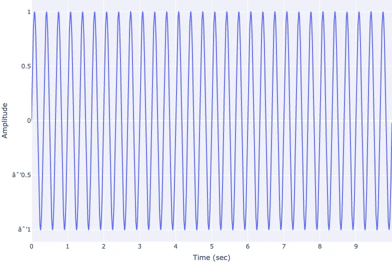
It makes sense to visualise our sine wave so we can get a better representation of the data. We will do this using a line chart with time along the x axis, and our amplitude values along the y axis.
fig = go.Figure(layout=dict(xaxis=dict(title='Time (sec)'),yaxis=dict(title='Amplitude')))

fig.add_scatter(x=time, y=sinewave)

fig.show()
Now we can see our sine wave in the time domain. We can clearly see the amplitude of the sinewave is 1, and the frequency of our sine wave is 3Hz.
Conclusion
In this section we have briefly covered a simple sine wave, how to create one in Python and how to visualise it in the time domain using a line chart.

