
Preamble
import numpy as np                   # for multi-dimensional containers
import pandas as pd                  # for DataFrames
import plotly.graph_objects as go    # for data visualisation
Introduction
In this section, we're going to use 120 years of Olympic history to create a visualisation. Let's set our sights on something that illustrates the distribution of Olympic medals awarded for the weightlifting sport.

The Dataset
We'll use the 120 years of Olympic history: athletes and results dataset, which we'll download and load with pandas. You're also welcome to use the mirrored that has been used in the following cell.
data_url = "https://shahinrostami.com/datasets/athlete_events.csv"
raw_data = pd.read_csv(data_url)
raw_data.head()
| ID | Name | Sex | Age | Height | Weight | Team | NOC | Games | Year | Season | City | Sport | Event | Medal | |
|---|---|---|---|---|---|---|---|---|---|---|---|---|---|---|---|
| 0 | 1 | A Dijiang | M | 24.0 | 180.0 | 80.0 | China | CHN | 1992 Summer | 1992 | Summer | Barcelona | Basketball | Basketball Men's Basketball | NaN |
| 1 | 2 | A Lamusi | M | 23.0 | 170.0 | 60.0 | China | CHN | 2012 Summer | 2012 | Summer | London | Judo | Judo Men's Extra-Lightweight | NaN |
| 2 | 3 | Gunnar Nielsen Aaby | M | 24.0 | NaN | NaN | Denmark | DEN | 1920 Summer | 1920 | Summer | Antwerpen | Football | Football Men's Football | NaN |
| 3 | 4 | Edgar Lindenau Aabye | M | 34.0 | NaN | NaN | Denmark/Sweden | DEN | 1900 Summer | 1900 | Summer | Paris | Tug-Of-War | Tug-Of-War Men's Tug-Of-War | Gold |
| 4 | 5 | Christine Jacoba Aaftink | F | 21.0 | 185.0 | 82.0 | Netherlands | NED | 1988 Winter | 1988 | Winter | Calgary | Speed Skating | Speed Skating Women's 500 metres | NaN |
It looks like the data was loaded without any issues. Let's have a quick look at the available features.
pd.DataFrame(raw_data.columns)
| 0 | |
|---|---|
| 0 | ID |
| 1 | Name |
| 2 | Sex |
| 3 | Age |
| 4 | Height |
| 5 | Weight |
| 6 | Team |
| 7 | NOC |
| 8 | Games |
| 9 | Year |
| 10 | Season |
| 11 | City |
| 12 | Sport |
| 13 | Event |
| 14 | Medal |
Data Wrangling
We're only interested in Olympic weightlifting data for our visualisation, so we'll filter by selecting all rows where the Sport is set to Weightlifting.
data = raw_data[raw_data.Sport == "Weightlifting"]
data.head()
| ID | Name | Sex | Age | Height | Weight | Team | NOC | Games | Year | Season | City | Sport | Event | Medal | |
|---|---|---|---|---|---|---|---|---|---|---|---|---|---|---|---|
| 80 | 22 | Andreea Aanei | F | 22.0 | 170.0 | 125.0 | Romania | ROU | 2016 Summer | 2016 | Summer | Rio de Janeiro | Weightlifting | Weightlifting Women's Super-Heavyweight | NaN |
| 154 | 59 | Ivan Nikolov Abadzhiev | M | 24.0 | 164.0 | 71.0 | Bulgaria | BUL | 1956 Summer | 1956 | Summer | Melbourne | Weightlifting | Weightlifting Men's Lightweight | NaN |
| 155 | 59 | Ivan Nikolov Abadzhiev | M | 28.0 | 164.0 | 71.0 | Bulgaria | BUL | 1960 Summer | 1960 | Summer | Roma | Weightlifting | Weightlifting Men's Middleweight | NaN |
| 156 | 60 | Mikhail Abadzhiev | M | 24.0 | 172.0 | 75.0 | Bulgaria | BUL | 1960 Summer | 1960 | Summer | Roma | Weightlifting | Weightlifting Men's Middleweight | NaN |
| 234 | 112 | Aziz Abbas | M | 21.0 | 169.0 | 67.0 | Iraq | IRQ | 1964 Summer | 1964 | Summer | Tokyo | Weightlifting | Weightlifting Men's Lightweight | NaN |
If we look at the Medal column in the table above, we can see NaN values for when an athlete was not awarded a medal. As we're only interested Olympic medalists for this visualisation, let's drop all the rows where no medal was awarded.
data = data[data.Medal.notna()]
data.head()
| ID | Name | Sex | Age | Height | Weight | Team | NOC | Games | Year | Season | City | Sport | Event | Medal | |
|---|---|---|---|---|---|---|---|---|---|---|---|---|---|---|---|
| 2331 | 1301 | Sri Wahyuni Agustiani | F | 21.0 | 147.0 | 47.0 | Indonesia | INA | 2016 Summer | 2016 | Summer | Rio de Janeiro | Weightlifting | Weightlifting Women's Flyweight | Silver |
| 2637 | 1480 | Franz Aigner | M | 32.0 | NaN | 107.0 | Austria | AUT | 1924 Summer | 1924 | Summer | Paris | Weightlifting | Weightlifting Men's Heavyweight | Silver |
| 3045 | 1698 | Khadzhimurat Magomedovich Akkayev | M | 19.0 | 178.0 | 105.0 | Russia | RUS | 2004 Summer | 2004 | Summer | Athina | Weightlifting | Weightlifting Men's Middle-Heavyweight | Silver |
| 3046 | 1698 | Khadzhimurat Magomedovich Akkayev | M | 23.0 | 178.0 | 105.0 | Russia | RUS | 2008 Summer | 2008 | Summer | Beijing | Weightlifting | Weightlifting Men's Middle-Heavyweight | Bronze |
| 3067 | 1713 | Artur Vladimirovich Akoyev | M | 26.0 | NaN | 109.0 | Unified Team | EUN | 1992 Summer | 1992 | Summer | Barcelona | Weightlifting | Weightlifting Men's Heavyweight II | Silver |
If we're interested, we can take a peek at how many medals have been awarded in total for bronze, silver, and gold.
pd.DataFrame(data.Medal.value_counts())
| Medal | |
|---|---|
| Gold | 217 |
| Bronze | 216 |
| Silver | 213 |
Now that we have our filtered and relevant data, let's build a list of participating countries. At first glance, it looks like Team may be the feature we're interested in, and for the Weightlifting sport, it is indeed a good selection. However, in other sports in the same dataset, we will see Teams such as Japan-1 and Japan-2.
pd.DataFrame(raw_data[raw_data.Team.str.contains("Japan")].Team.unique())
| 0 | |
|---|---|
| 0 | Japan |
| 1 | Japan-1 |
| 2 | Japan-2 |
| 3 | Japan-3 |
For now, we'll continue with the NOC feature, which holds the name of the National Olympic Committee for each athlete.
noc = data.NOC.unique().tolist()
print(noc)
['INA', 'AUT', 'RUS', 'EUN', 'BUL', 'URS', 'LUX', 'USA', 'JPN', 'IRI', 'TUR', 'FRA', 'BLR', 'GEO', 'IRQ', 'HUN', 'AUS', 'POL', 'ROU', 'GER', 'SWE', 'ITA', 'CUB', 'GDR', 'CHN', 'NED', 'TPE', 'KAZ', 'PRK', 'MDA', 'GBR', 'ARM', 'UKR', 'BEL', 'CAN', 'PHI', 'LTU', 'GRE', 'TCH', 'EGY', 'COL', 'FIN', 'VIE', 'SUI', 'FRG', 'KOR', 'THA', 'NOR', 'DEN', 'MEX', 'EST', 'TTO', 'IND', 'UZB', 'NGR', 'CRO', 'VEN', 'QAT', 'LAT', 'ARG', 'SGP', 'LIB', 'ESP', 'AZE']
Visualising the Data
Now that we have prepared our data, let's create a few visualisations. Instead of just showing you the final visualisation, we will develop our visualisation incrementally, where each subsequent visualisation improves on the last.
Stacked Bar Chart - Iteration 1
When we started this notebook, we had the idea of creating a stacked bar chart to visualise the medals awarded to each country in the weightlifting sport. Our first visualisation may look something like the following.
fig = go.Figure(layout=dict(barmode="stack"))

fig.add_bar(
    name="Bronze",
    x=noc,
    y=data[data.Medal == "Bronze"].NOC.value_counts().reindex(noc),
    marker_color="brown",
)

fig.add_bar(
    name="Silver",
    x=noc,
    y=data[data.Medal == "Silver"].NOC.value_counts().reindex(noc),
    marker_color="silver",
)

fig.add_bar(
    name="Gold",
    x=noc,
    y=data[data.Medal == "Gold"].NOC.value_counts().reindex(noc),
    marker_color="gold",
)

fig.show()
It's not a bad start! We have our bars stacked in the right order, from bronze up to gold, and our colours were selected to be gold, silver, and brown (as no colour parameter exists for bronze).
Stacked Bar Chart - Iteration 2
However, we can make some improvements to enhance the usefulness and beauty of the visualisation. Let's try the following: - Assign some specific HEX colour codes for our bar colours, - Order the bars in descending order by total medals awarded, - and Angle the bar (tick) labels at -45 degrees.
fig = go.Figure(
    layout=dict(
        barmode="stack",
        xaxis=dict(categoryorder="total descending", tickangle=-45),
    )
)

fig.add_bar(
    name="Bronze",
    x=noc,
    y=data[data.Medal == "Bronze"].NOC.value_counts().reindex(noc),
    marker_color="#A57164",
)

fig.add_bar(
    name="Silver",
    x=noc,
    y=data[data.Medal == "Silver"].NOC.value_counts().reindex(noc),
    marker_color="#C0C0C0",
)

fig.add_bar(
    name="Gold",
    x=noc,
    y=data[data.Medal == "Gold"].NOC.value_counts().reindex(noc),
    marker_color="#FFD700",
)

fig.show()
Great! It's already looking easier to navigate, and the colours are more suitable for the data they're representing.
Stacked Bar Chart - Iteration 3
Let's continue to make improvements, this time we'll try the following: - Reduce the font-size of the bar (tick) labels, as some currently disappear if the width of the plot is too small (e.g., when shrinking the browser width), - Change the font-colour of our bar (tick) labels, - Add an outline and some transparency to our bars, - Reduce the gaps between our bars, - Hide the y-axis ticks, - and Add a thick line at the bottom of the x-axis.
fig = go.Figure(
    layout=dict(
        barmode="stack",
        bargap=0.1,
        xaxis=dict(
            categoryorder="total descending",
            tickangle=-45,
            showline=True,
            linewidth=2,
            linecolor="black",
            ticks="",
            tickfont=dict(size=8, color="black"),
        ),
        yaxis=dict(showticklabels=False),
    )
)

fig.add_bar(
    name="Bronze",
    x=noc,
    y=data[data.Medal == "Bronze"].NOC.value_counts().reindex(noc),
    marker_color="#A57164",
)

fig.add_bar(
    name="Silver",
    x=noc,
    y=data[data.Medal == "Silver"].NOC.value_counts().reindex(noc),
    marker_color="#C0C0C0",
)

fig.add_bar(
    name="Gold",
    x=noc,
    y=data[data.Medal == "Gold"].NOC.value_counts().reindex(noc),
    marker_color="#FFD700",
)

fig.update_traces(
    marker_line_color="#003366", marker_line_width=1, opacity=0.7
)

fig.show()
Looking good!
Stacked Bar Chart - Final Iteration
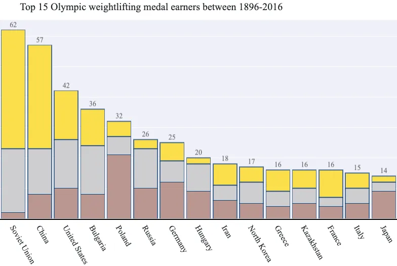
Now to wrap things up, we may be interested in just selecting the "top 15" medal earning countries for weightlifting. We'll also start using the Team feature instead of working with the NOC. This will require some additional preparation. First, we'll determine the top 15 medal earners.
top_15 = data.Team.value_counts()[:15]
pd.DataFrame(top_15)
| Team | |
|---|---|
| Soviet Union | 62 |
| China | 57 |
| United States | 42 |
| Bulgaria | 36 |
| Poland | 32 |
| Russia | 26 |
| Germany | 25 |
| Hungary | 20 |
| Iran | 18 |
| North Korea | 17 |
| Greece | 16 |
| France | 16 |
| Kazakhstan | 16 |
| Italy | 15 |
| Japan | 14 |
Next, we'll filter our data to only include rows from these teams.
data = data[data.Team.isin(list(top_15.index.values))]
teams = data.Team.unique().tolist()
data.head()
| ID | Name | Sex | Age | Height | Weight | Team | NOC | Games | Year | Season | City | Sport | Event | Medal | |
|---|---|---|---|---|---|---|---|---|---|---|---|---|---|---|---|
| 3045 | 1698 | Khadzhimurat Magomedovich Akkayev | M | 19.0 | 178.0 | 105.0 | Russia | RUS | 2004 Summer | 2004 | Summer | Athina | Weightlifting | Weightlifting Men's Middle-Heavyweight | Silver |
| 3046 | 1698 | Khadzhimurat Magomedovich Akkayev | M | 23.0 | 178.0 | 105.0 | Russia | RUS | 2008 Summer | 2008 | Summer | Beijing | Weightlifting | Weightlifting Men's Middle-Heavyweight | Bronze |
| 4001 | 2306 | Ruslan Vladimirovich Albegov | M | 24.0 | 192.0 | 156.0 | Russia | RUS | 2012 Summer | 2012 | Summer | London | Weightlifting | Weightlifting Men's Super-Heavyweight | Bronze |
| 4360 | 2483 | Rumen Aleksandrov | M | 20.0 | 176.0 | 89.0 | Bulgaria | BUL | 1980 Summer | 1980 | Summer | Moskva | Weightlifting | Weightlifting Men's Middle-Heavyweight | Silver |
| 4404 | 2511 | Vasily Ivanovich Alekseyev | M | 30.0 | 185.0 | 160.0 | Soviet Union | URS | 1972 Summer | 1972 | Summer | Munich | Weightlifting | Weightlifting Men's Super-Heavyweight | Gold |
Finally, we'll produce our final visualisation that will display the top 15 medal earning countries (or teams) for the weightlifting sport. We'll also try the following improvements to our visualisation: - Changing the fonts to use Muli (if it's available), - Hide the legend as the bar colours are all we need, - Adding a title (and some top-margin to give it space), - Adding text above our bars indicating the total medals per country, - Increasing the thickness of our bar outlines (as we have fewer bars now), - and Changing the angle of the bar (tick) labels to 60 degrees, so they stay within the boundaries of our visualisation.
fig = go.Figure(
    layout=dict(
        title="Top 15 Olympic weightlifting medal earners between {}-{}".format(
            data.Year.min(), data.Year.max()
        ),
        barmode="stack",
        bargap=0.1,
        margin=dict(t=40, r=0, b=0, l=0),
        font=dict(
            family="Muli",
            size=14,
            color="#212529",
        ),
        showlegend=False,
        xaxis=dict(
            categoryorder="total descending",
            tickangle=60,
            showline=True,
            linewidth=2,
            linecolor="black",
            ticks="",
            tickfont=dict(family="Muli", size=16, color="#212529"),
        ),
        yaxis=dict(showticklabels=False),
    ),
)

fig.add_bar(
    name="Bronze",
    x=teams,
    y=data[data.Medal == "Bronze"].Team.value_counts().reindex(teams),
    marker_color="#A57164",
)

fig.add_bar(
    name="Silver",
    x=teams,
    y=data[data.Medal == "Silver"].Team.value_counts().reindex(teams),
    marker_color="#C0C0C0",
)

fig.add_bar(
    name="Gold",
    x=teams,
    y=data[data.Medal == "Gold"].Team.value_counts().reindex(teams),
    marker_color="#FFD700",
    text=data.Team.value_counts().reindex(teams),
    textposition="outside",
)

fig.update_traces(
    marker_line_color="#003366",
    marker_line_width=1.5,
    opacity=0.7,
    textfont_size=14,
)

fig.show()
Conclusion
In this section, we went through a few improvement cycles to produce a visualisation illustrating the top Olympic weightlifting medal earners in the 120 years of Olympic history: athletes and results dataset.
The visualisation ended up looking great, but a few plotly limitations prevented one final improvement - changing the bar colours to be gradients.