Data Analysis with Rust Notebooks

A practical book on Data Analysis with Rust Notebooks that teaches you the concepts and how they’re implemented in practice.

Get the book
Interactive Chord Diagrams

Preamble

:sccache 1
:dep plotapi = {Version = "0.1.0"}

use plotapi::params;
use plotapi::Visualisation;

Introduction

In a chord diagram (or radial network), entities are arranged radially as segments with their relationships visualised by arcs that connect them. The size of the segments illustrates the numerical proportions, whilst the size of the arc illustrates the significance of the relationships1.

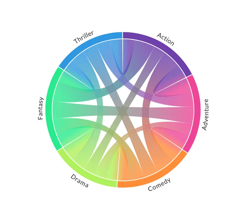
Chord diagrams are useful when trying to convey relationships between different entities, and they can be beautiful and eye-catching.

Get PlotAPI Chord

Click here to get access to the full-featured chord visualization API, producing beautiful interactive visualizations, e.g. those featured on the front page of Reddit.

  • Produce beautiful interactive Chord diagrams.
  • Customize colours and font-sizes.
  • Access Divided mode, enabling two sides to your diagram.
  • Symmetric and Asymmetric modes,
  • Add images and text on hover,
  • Access finer-customisations including HTML injection.
  • Allows commercial use without open source requirement.
  • Currently supports Python, JavaScript, and Rust, with many more to come (accepting requests).

PlotAPI Chord submissions

The Chord Crate

You can get the crate either from crates.io or from the GitHub repository. With your processed data, you should be able to plot something beautiful with just a single line. To get access, visit the PlotAPI website.

The Dataset

The focus for this section will be the demonstration of the chord crate. To keep it simple, we will use synthetic data that illustrates the co-occurrences between movie genres within the same movie.

let matrix: Vec<Vec<f64>> = vec![
    vec![0., 5., 6., 4., 7., 4.],
    vec![5., 0., 5., 4., 6., 5.],
    vec![6., 5., 0., 4., 5., 5.],
    vec![4., 4., 4., 0., 5., 5.],
    vec![7., 6., 5., 5., 0., 4.],
    vec![4., 5., 5., 5., 4., 0.],
];

let names: Vec<String> = vec![
    "Action",
    "Adventure",
    "Comedy",
    "Drama",
    "Fantasy",
    "Thriller",
]
.into_iter()
.map(String::from)
.collect();

Chord Diagrams

Let's see what the Chord defaults produce when we invoke the show() method.

Visualisation {
    api_key: your_api_key,
    endpoint: "chord",
    params: params!({
        "matrix": matrix,
        "names": names,
        "curved_labels": true
    })
}.show();

Different Colours

The defaults are nice, but what if we want different colours? You can pass in almost anything from d3-scale-chromatic, or you could pass in a list of hexadecimal colour codes.

Visualisation {
    api_key: your_api_key,
    endpoint: "chord",
    params: params!({
        "matrix": matrix,
        "names": names,
        "colors": vec![String::from("d3.schemeSet2")],
        "curved_labels": true
    })
}.show();
PlotAPI - Chord Diagram
Visualisation {
    api_key: your_api_key,
    endpoint: "chord",
    params: params!({
        "matrix": matrix,
        "names": names,
        "curved_labels": true,
        "colors": vec![String::from("d3.schemeSet3")],
    })
}.show();
PlotAPI - Chord Diagram
Visualisation {
    api_key: your_api_key,
    endpoint: "chord",
    params: params!({
        "matrix": matrix,
        "names": names,
        "curved_labels": true,
        "colors": vec![String::from(format!("d3.schemePuRd[{:?}]",names.len()))],
    })
}.show();
PlotAPI - Chord Diagram
Visualisation {
    api_key: your_api_key,
    endpoint: "chord",
    params: params!({
        "matrix": matrix,
        "names": names,
        "curved_labels": true,
        "colors": vec![String::from(format!("d3.schemeYlGnBu[{:?}]",names.len()))],
    })
}.show();
PlotAPI - Chord Diagram
let hex_colours: Vec<String> = vec![
    "#222222", "#333333", "#4c4c4c", "#666666", "#848484", "#9a9a9a",
]
.into_iter()
.map(String::from)
.collect();

Visualisation {
    api_key: your_api_key,
    endpoint: "chord",
    params: params!({
        "matrix": matrix,
        "names": names,
        "curved_labels": true,
        "colors": hex_colours,
    }),
}
.show();
PlotAPI - Chord Diagram

Label Styling

We can disable wrapped labels, and even change the colour.

Visualisation {
    api_key: your_api_key,
    endpoint: "chord",
    params: params!({
        "matrix": matrix,
        "names": names,
        "label_colors":"#4c40bf".to_string(),
        "colors": hex_colours,
    })
}.show();
PlotAPI - Chord Diagram

Opacity

We can also change the default opacity of the relationships.

Visualisation {
    api_key: your_api_key,
    endpoint: "chord",
    params: params!({
        "matrix": matrix,
        "names": names,
        "opacity": 0.1,
        "curved_labels": true,
        "label_colors_match":true,
    })
}.show();
PlotAPI - Chord Diagram

Width

We can also change the maximum width the plot.

Visualisation {
    api_key: your_api_key,
    endpoint: "chord",
    params: params!({
        "matrix": matrix,
        "names": names,
        "width": 400,
        "curved_labels": true,
        "reverse_gradients":true,
    })
}.show();
PlotAPI - Chord Diagram

Conclusion

In this section, we've introduced the chord diagram and chord crate. We used the crate and some synthetic data to demonstrate several chord diagram visualisations with different configurations. The chord Python crate is available for free from crates.io or from the GitHub repository.


  1. Tintarev, N., Rostami, S., & Smyth, B. (2018, April). Knowing the unknown: visualising consumption blind-spots in recommender systems. In Proceedings of the 33rd Annual ACM Symposium on Applied Computing (pp. 1396-1399). 

Comments

From the collection

Data Analysis with Rust Notebooks

A practical book on Data Analysis with Rust Notebooks that teaches you the concepts and how they’re implemented in practice.

Get the book

ISBN

978-1-915907-10-3

Cite

Rostami, S. (2020). Data Analysis with Rust Notebooks. Polyra Publishing.