Preamble
import numpy as np                   # for multi-dimensional containers
import pandas as pd                  # for DataFrames
import plotly.graph_objects as go    # for data visualisation
from geopy.geocoders import Nominatim
from geopy.exc import GeocoderTimedOut
from IPython.display import display, clear_output
Introduction
I came across the Table of confirmed cases of COVID-19 in England provided by Public Health England and thought it would be useful to visualise it. I have no doubt a similar visualisation already exists, but I thought it would be an interesting exercise. The data used throughout this notebook was last updated at 9:00 am on 10 March 2020.
Note taken from the data source
Data may be subject to delays in case confirmation and reporting, as well as ongoing data cleaning.
Location is based on case residential postcode. When this is not available, NHS trust or reporting laboratory postcode is used. The data is therefore subject to change.
Counts for Isles of Scilly and City of London are combined with Cornwall and Hackney respectively for disclosure control.
Visualising the Table
The first step was to copy and paste the data from the table into a CSV, followed by adding two column headings for lat and lon respectively. I have hosted the CSV for convenient and easy reproducibility.
Let's load the data into a pandas.DataFrame and look at the first few records.
data = pd.read_csv('https://datacrayon.com/datasets/phe_covid_uk.csv')
data.head()
| local_authority | confirmed_cases | lat | lon | |
|---|---|---|---|---|
| 0 | Barking and Dagenham | 1 | NaN | NaN |
| 1 | Barnet | 8 | NaN | NaN |
| 2 | Barnsley | 2 | NaN | NaN |
| 3 | Bath and North East Somerset | 0 | NaN | NaN |
| 4 | Bedford | 0 | NaN | NaN |
We have the local authority (we can consider these to be locations) and the number of confirmed cases. You can also see our lat and lot columns are empty. Let's populate these by making requests through GeoPy.
First, we need an instance of the Nominatim (geocoder for OpenStreetMap data) object. We don't want to violate the usage policy, so we'll also pass in a user_agent.
geolocator = Nominatim(user_agent="covid_datacrayon.com")
Let's see if we can get some location data using one of our local_authority items. To demonstrate, we'll use the one for my hometown, Bournemouth.
data.local_authority[10]
'Bournemouth, Christchurch and Poole'
This will now be passed into the geocode() method. We'll also append "UK" to the string for disambiguation, e.g. France has a "Bury" too.
location = geolocator.geocode(f"{data.local_authority[10]}, UK")
location
Location(Bournemouth, Bournemouth, Christchurch and Poole, England, BH2 6EG, United Kingdom, (50.720097, -1.8799272, 0.0))
It looks like it's returned all the information we need. We will need to access this directly too.
print(location.latitude, location.longitude)
50.720097 -1.8799272
Now we need to do this for every local_authority in our dataset and fill in the missing lat and lon values.
for index, row in data.iterrows():
    location = geolocator.geocode(f"{row.local_authority}, UK", timeout=100)

    if location:
        data.loc[index, "lat"] = location.latitude
        data.loc[index, "lon"] = location.longitude

    # None of the following code is required
    # I just wanted a progress bar!
    clear_output(wait=True)
    amount_unloaded = np.floor(
        ((data.shape[0] - index) / data.shape[0]) * 25
    ).astype(int)
    amount_loaded = np.ceil((index / data.shape[0]) * 25).astype(int)
    loading = (
        f"Retrieving locations >{'|'*amount_loaded}{'.'*amount_unloaded}<"
    )
    display(loading)

print("Done!")
'Retrieving locations >|||||||||||||||||||||||||Done!
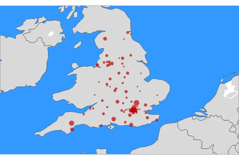
Now let's put this on the map! We'll go for a bubble plot on a map of the UK, where larger bubbles indicate more confirmed cases.
data["text"] = (
    data["local_authority"]
    + "<br>Confirmed Cases "
    + (data["confirmed_cases"]).astype(str)
)

fig = go.Figure()

fig.add_trace(
    go.Scattergeo(
        locationmode="country names",
        lon=data["lon"],
        lat=data["lat"],
        text=data["text"],
        marker=dict(
            size=data["confirmed_cases"] / 0.1,
            color="rgb(200,0,0)",
            line_color="rgb(122,0,0)",
            line_width=0.5,
            sizemode="area",
        ),
    )
)

fig.update_layout(
    geo=dict(
        resolution=50,
        scope="europe",
        center={
            "lat": (data.lat.min() + data.lat.max()) / 2,
            "lon": (data.lon.min() + data.lon.max()) / 2,
        },
        projection=go.layout.geo.Projection(
            type="azimuthal equal area", scale=8
        ),
        landcolor="rgb(217, 217, 217)",
        showocean=True,
    )
)

fig.show()
It's an interactive plot, so you can hover over it to get more information.
Conclusion
In this notebook, we went on a rather quick journey. We copy and pasted some data from a web page, used a helpful service to populate some location data, and plotted it all on a map using Plotly.

