
This will be the first article in a four part series covering the following:
- Dataset analysis - We will present and discuss a dataset selected for our machine learning experiment. This will include some analysis and visualisations to give us a better understanding of what we're dealing with.
- Experimental design - Before we conduct our experiment, we need to have a clear idea of what we're doing. It's important to know what we're looking for, how we're going to use our dataset, what algorithms we will be employing, and how we will determine whether the performance of our approach is successful.
- Implementation - We will use the Keras API on top of TensorFlow to implement our experiment. All code will be in Python, and at the time of publishing everything is guaranteed to work within a Kaggle Notebook.
- Results - Supported by figures and statistics, we will have a look at how our solution performed, and discuss anything interesting about the results.
Dataset analysis
In the last article we introduced Kaggle's primary offerings and proceeded to execute our first " Hello World" program within a Kaggle Notebook. In this article, we're going to move onto conducting our first machine learning experiment within a Kaggle Kernel notebook.
To facilitate a gentle learning experience, we will try to rely on (relatively) simple/classic resources in regard to the selected dataset, tools, and algorithms. This article assumes you know what Kaggle is, and how to create a Kaggle Notebook.
Note
Although this article is focussed on the use of Kaggle Notebooks, this experiment can be reproduced in any environment with the required packages. Kaggle Notebooks are great because you can be up and running in a few minutes!
Put simply, if we want to conduct a machine learning experiment, we typically need something to learn from. Often, this will come in the form of a dataset, either collected from some real-world setting, or synthetically generated e.g. as a test dataset.
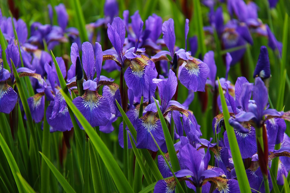
Iris Flower Dataset
To keep things manageable, we will rely on the famous tabular Iris Flower Dataset, created by Ronald Fischer. This is one of the most popular datasets in existence, and has been used in many tutorials/examples found in the literature.

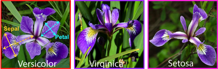
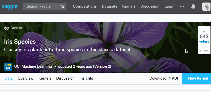
You can find the dataset within the UCI Machine Learning Repository, and it's also hosted by Kaggle. The multivariate dataset contains 150 samples of the following four real-valued attributes:
- sepal length,
- sepal width,
- petal length,
- and petal width.
All dimensions are suppled in centimetres. Associated with every sample is also the known classification of the flower:
- Setosa,
- Versicolour,
- or Virginica.
Typically, this dataset is used to produce a classifier which can determine the classification of the flower when supplied with a sample of the four attributes.
Notebook + Dataset = Ready
Let's have a closer look at the dataset using a Kaggle Notebook. If your desired dataset is hosted on Kaggle, as it is with the Iris Flower Dataset, you can spin up a Kaggle Notebook easily through the web interface:
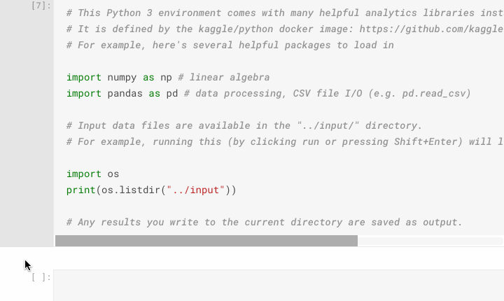
Once the notebook environment has finished loading, you will be presented with a cell containing some default code. This code does two things:
-
Import Packages - You will see three import statements which load the
os(various operating system tasks),numpy(for linear algebra), andpandas(for data processing)_ packages. Unless you plan on implementing everything from scratch (re-inventing the wheel), then you will be making use of excellent and useful packages that are available for free. -
Directory Listing - One of the first difficulties encountered by new users of Kaggle Notebooks and similar platforms is: "How do I access my dataset?" or "Where are my dataset files?". Kaggle appear to have pre-empted these questions with their default code which displays a directory listing of their input directory,
../input. When executing this default cell you will be presented with a list of files in that directory, so you know that using the path../input/[filename]will point to what you want. Execute this code on our Iris Flower Kaggle Notebook and you will seeIris.csvamongst the files available. This file consisting of comma-separated values is what we will be using throughout our analysis, located at../input/Iris.csv.
Analysis with pandas
Now that we know where our dataset is located, let's load it into a DataFrame using pandas.read_csv. Then, to have a quick look at what the data looks like we can use the pandas.DataFrame.head() function to list the first 5 samples of our dataset.
iris_data = pd.read_csv("/kaggle/input/Iris.csv")
iris_data.head()
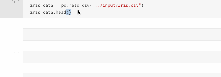
The tabular output of the head() function shows us that the data has been loaded, and what 's helpful is the inclusion of the column headings which we can use to reference specific columns later on.
DataFrame.head( n=5 ). This function returns the first n rows for the object based on position. It is useful for quickly testing if your object has the right type of data in it.
Pandas documentation
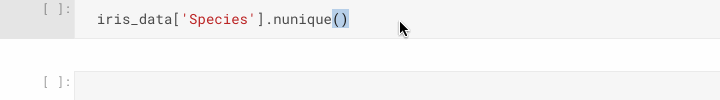
Let's start interrogating our dataset. First, let's confirm we only have three different species classifications in our dataset, not more or less. There are many ways to achieve this, but one easy way is to use pandas.DataFrame.nunique() on the Species column.
iris_data['Species'].nunique()
We've now confirmed the number of classes, another point of interest may be to find out the number of samples we have. Again, there are many ways to achieve this too, e.g. pandas.DataFrame.shape which returns the dimensionality of our dataset, and pandas.DataFrame.count() which counts non-NA cells along the specified axis (columns by default).
iris_data.shape        # display the dimensionality
iris_data.count()      # count non-NA cells
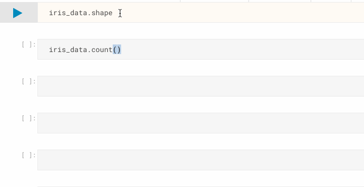
Now we can be sure there are no NA cells, and that we have the 150 samples that we were expecting. Let's move onto confirming the classification distribution of our samples, remembering that we are expecting a 50/50/50 split from the dataset description. One way to get this information is to use pandas.Series.value_counts(), which returns a count of unique values.
iris_data['Species'].value_counts()
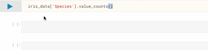
As you can see, value_counts() has listed the number of instances per class, and it appears to be exactly what we were expecting.
Creating useful visualisations
Purely for the sake of starting some visualisation, let's create a bar-chart. There are many packages which enable visualisation with Python, and typically I rely on matplotlib. However, pandas has some easy to use functions which use matplotlib internally to create plots. Let's have a look at pandas.DataFrame.plot.bar(), which will create a bar-chart from the data we pass in.
iris_data['Species'].value_counts().plot.bar()
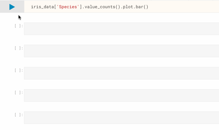
Nothing unexpected from this plot, as we know our dataset samples are classified into three distinct species in a 50/50/50 split, but now we can present this information visually.
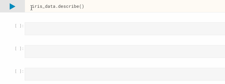
Let's shift our attention to our four attributes, perhaps we're interested in the value range of each attribute, along with some indication of the statistics. It's always a good idea to have a quick look at the pandas documentation before attempting to code something up yourself, because it's often the case that pandas has a nice helper function for what you're after. In this case, we can use pandas.DataFrame.describe to generate some descriptive statistics for our dataset, and it actually includes some information we generated earlier in this article.
iris_data.describe()
What if we want to visualise our attributes to see if we can make any interesting observations? One approach is to use a parallel coordinate plot. Depending on the size of your dataset, it may not be feasible to use this type of plot as the output will be too cluttered and almost useless as a visualisation. However, with the Iris Flower Dataset being small, we can go ahead and use pandas.plotting.parallel_coordinates().
pd.plotting.parallel_coordinates(iris_data, "Species")
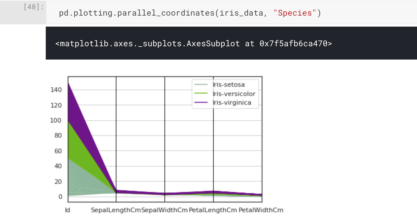
The parallel coordinate plot has worked as intended, but in practice we can see there's an issue: the magnitude of the range of differences between our attributes has made the visualisation difficult to interpret. Of course, it would actually be a useful visualisation for illustrating this fact. In this case, we can see the Id attribute has been included in our plot, and we don't actually need or want this to be visualised. Removing this from the input to the plotting function may be all we need to do.
pd.plotting.parallel_coordinates(iris_data.drop("Id", axis=1), "Species")
Here we have used pandas.DataFrame.drop() to drop the Id column when we pass the Iris Flower Dataset to the parallel_coordinate function. This is done by specifying the first parameter, label, and the second parameter, axis=1 (to indicate columns).
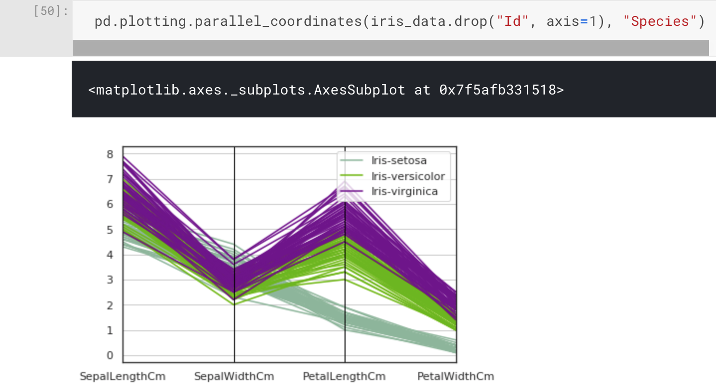
That plot looks much better, and we can now see something interesting in the clustering of the attributes with regard to the species classifications. What stands out the most is the Setosa species, which looks to have a different pattern compared to Versicolor and Virginica. This was actually mentioned in the dataset description.
One class is linearly separable from the other 2; the latter are NOT linearly separable from each other.
UCI Machine Learning Repository: Iris Data Set
It's still interesting to have a closer look, and it's good practice for when working on different - perhaps undocumented - datasets. To do this we will use a scatter plot matrix, which will show us pairwise scatter plots of all of our attributes in a matrix format. Pandas has pandas.plotting.scatter_matrix() which is intuitive until you want to colour markers by category (or species), so we will instead import a high-level visualisation library based on matplotlib called seaborn. From seaborn we can use seaboard.pairplot() to plot our pairwise relationships.
import seaborn as sns
sns.pairplot(iris_data.drop("Id",axis=1), hue="Species")
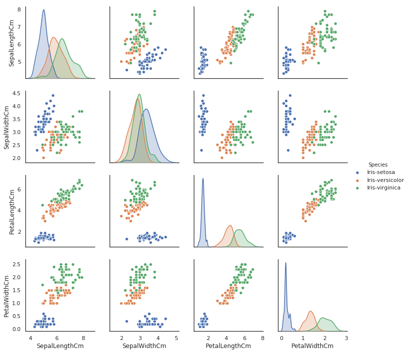
This is an incredibly useful visualisation which only required a single line of code, and we also have the kernel density estimates of the underlying features along the diagonal of the matrix. In this scatter plot matrix, we can confirm that the Setosa species is linearly separable, and if you wanted to you could draw a dividing line between this species and the other two. However, the Versicolor and Virginica classes are not linearly separable.
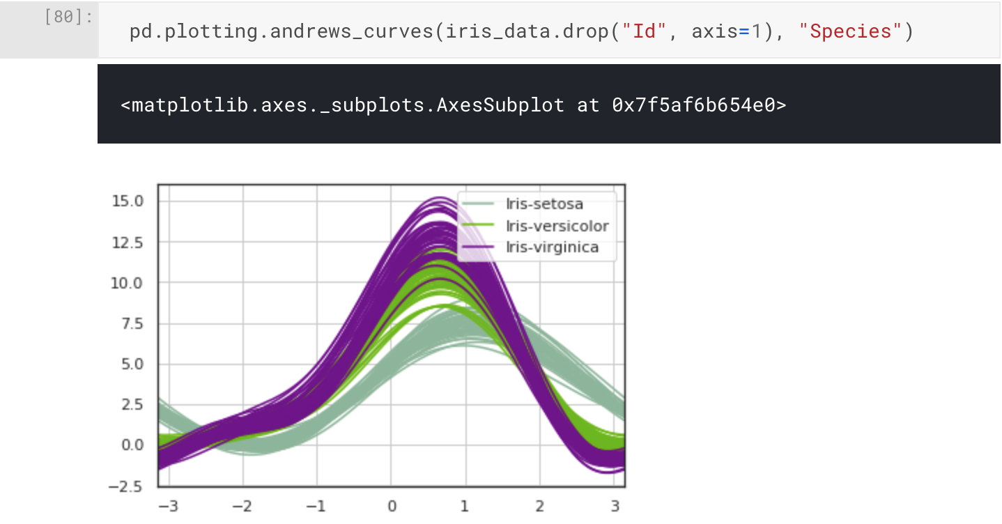
One final visualisation I want to share with you is the Andrew Curves plot for visualising clusters of multivariate data. We can plot this using pandas.plotting.andrews_curves().
pd.plotting.andrews_curves(iris_data.drop("Id", axis=1), "Species")
Conclusion
In this article we've introduced and analysed the Iris Flower Dataset. For our analysis, we've used the various helpful functions from the pandas package, and then we proceeded to create some interesting visualisations using pandas and seaborn on top of matplotlib. All code was written and executed within a Kaggle Notebook, here it is if you are interested, but for now all the corresponding narrative is in this article.
Now that we have a good idea about the dataset, we can move onto our experimental design. In the next part of this four part series, we will design our experiments and select some algorithms and performance measures to support our implementation and discussion of the results