Beautiful Works on
Data Science & Visualisation
Research and Development
Shahin is a Data Scientist with Software Engineering skills that have been honed over two decades. He has multidisciplinary experience in both industry and academia, where he has demonstrated innovation and leadership.
He has authored many books and peer-reviewed publications on the subjects of Data Science, Visualisation, and Evolutionary Computation. He is the founder of PlotAPI.com, a powerful API and App, enabling the creation of engaging interactive visualisations that have been used in publications by academia, government, and industry.
Dr. Shahin Rostami

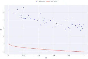
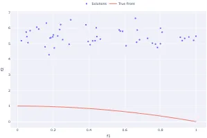
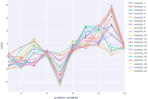
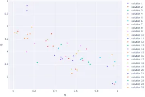
Practical Evolutionary Algorithms
A practical book on Evolutionary Algorithms that teaches you the concepts and how they’re implemented in practice.
Get the book


Data Analysis with Rust Notebooks
A practical book on Data Analysis with Rust Notebooks that teaches you the concepts and how they’re implemented in practice.
Get the book


Data is Beautiful
A practical book on data visualisation that shows you how to create static and interactive visualisations that are engaging and beautiful.
Get the book

Visualisation with D3.js
A practical book on visualisation with D3.js that shows you how to create visualisations from the ground up that are engaging and beautiful.
Get the book


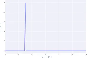
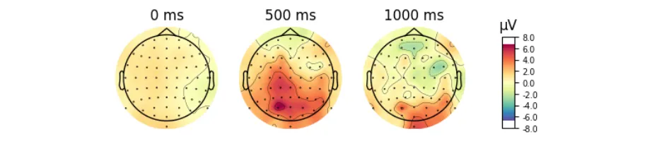
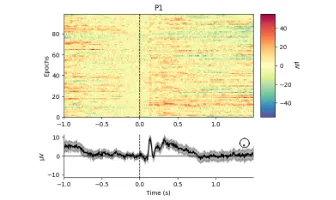
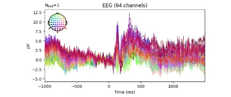
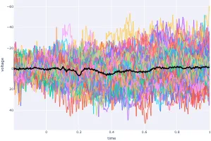
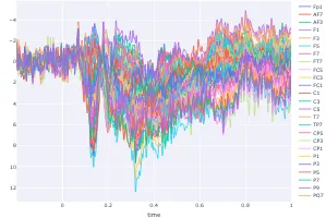
Signal Processing
Signal processing basics and EEG.
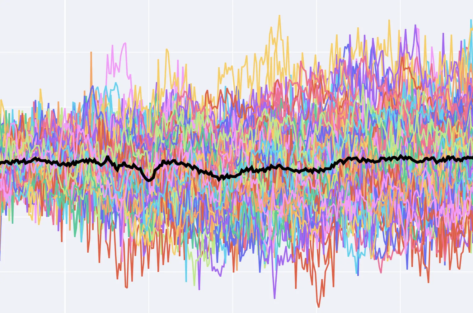
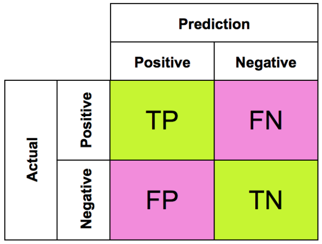
Machine Learning
A collection of articles on Machine Learning that teach you the concepts and how they’re implemented in practice.


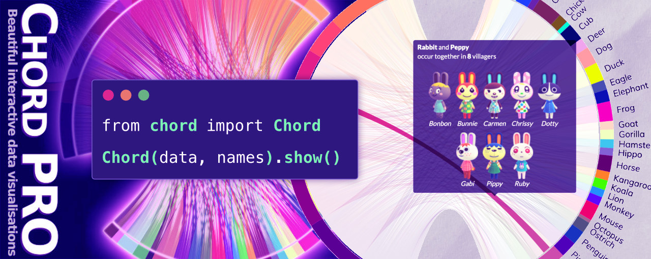
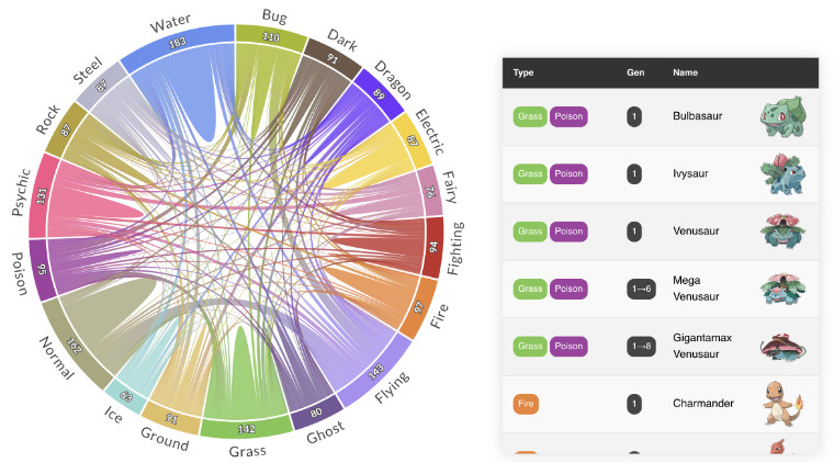
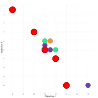
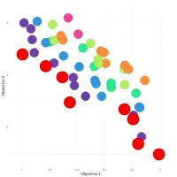
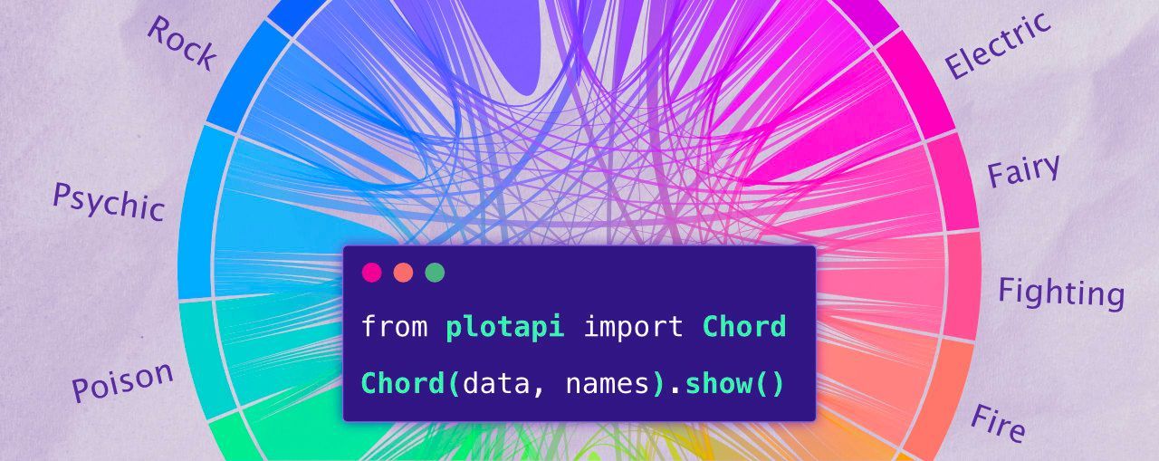
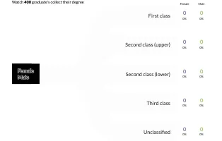
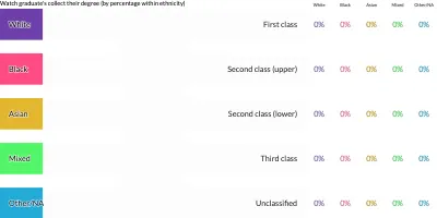
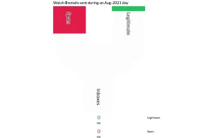
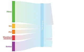
PlotAPI, beautiful by default
Easily turn your data into engaging visualizations. Powerful API for coders. Powerful app for everyone.
Get the software
Introduction
API for coders
REST API
Visualizations
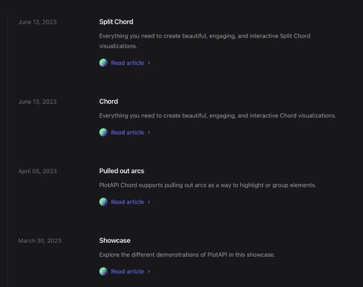
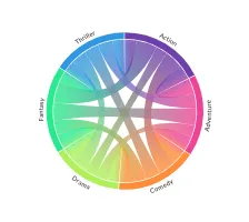
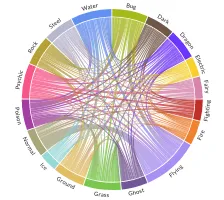
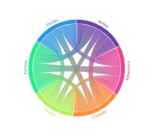
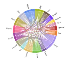
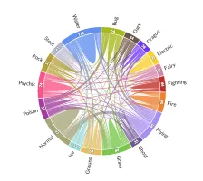
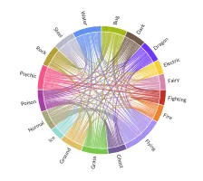
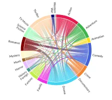
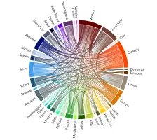
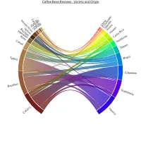
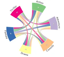
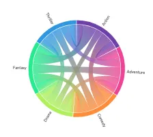
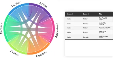
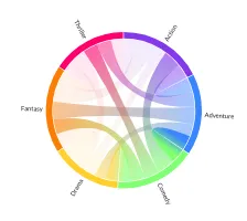
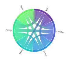
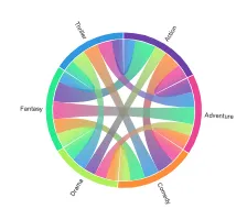
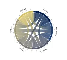
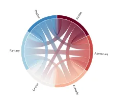
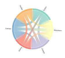
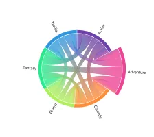
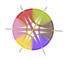
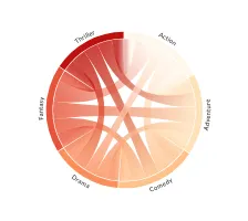
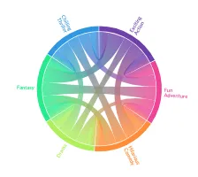
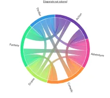
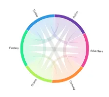
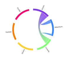
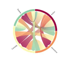
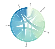
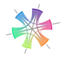
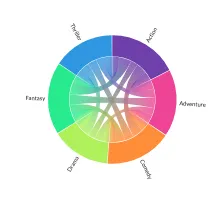
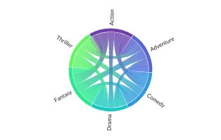
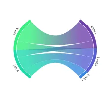
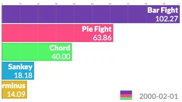
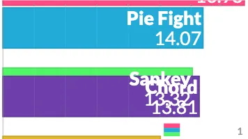
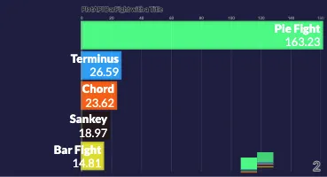
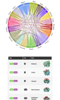
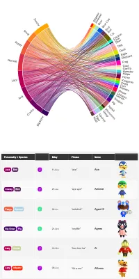
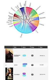
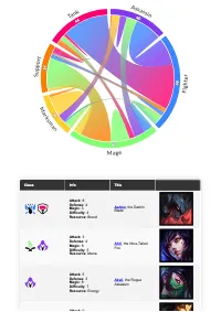
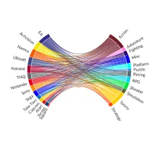
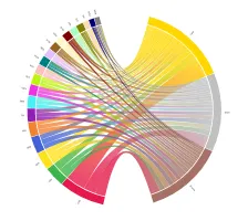
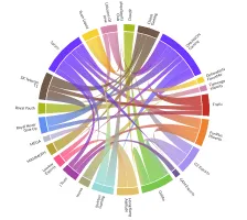
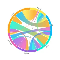
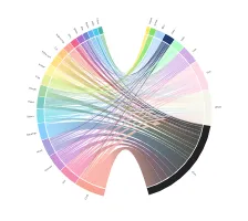
Chord
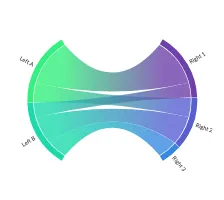
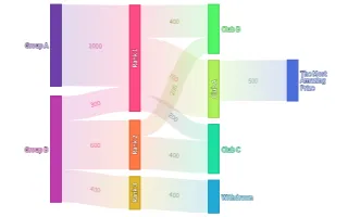
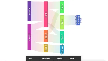
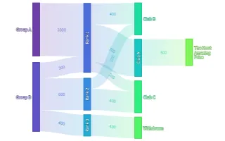
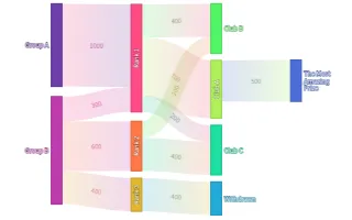
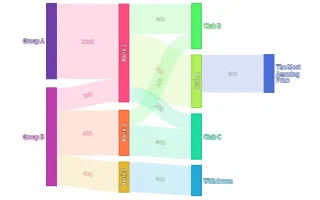
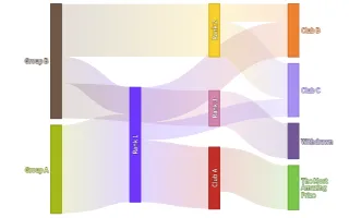
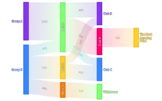
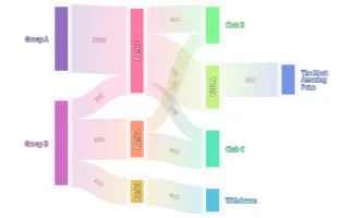
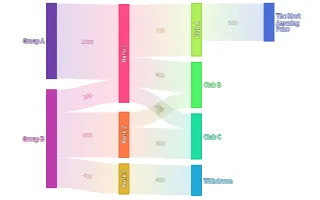
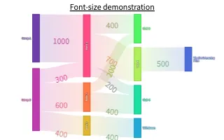
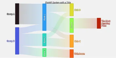
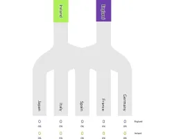
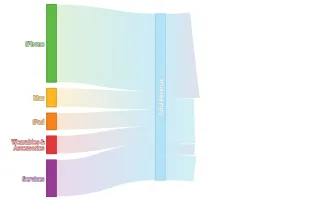
Sankey


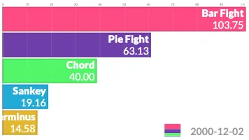
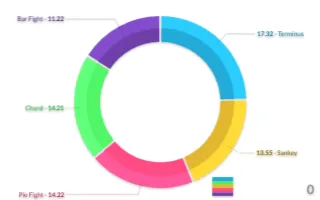
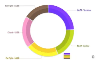
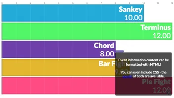
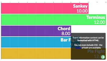
Pie Fight
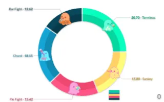
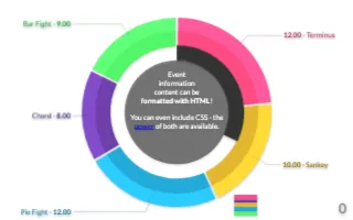
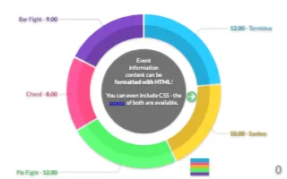
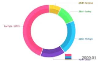
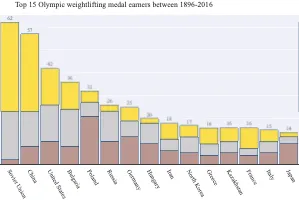
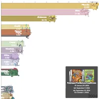
Bar Fight
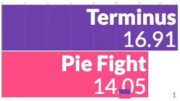
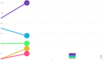
Line Fight
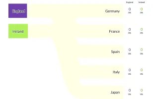
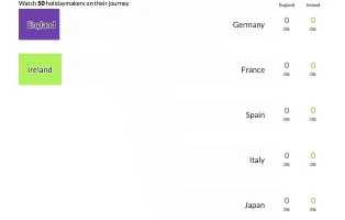
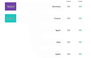
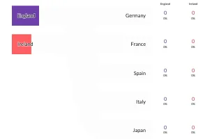
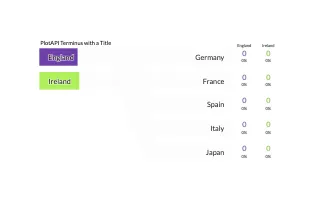
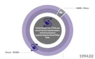
Terminus


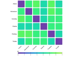
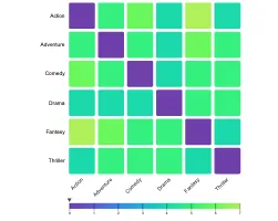
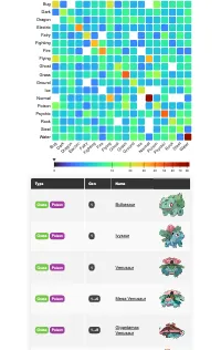
Heat Map
Showcase
Reference
Dr. Shahin Rostami
Writing on data science, computer science, tinkering, and hacking.